A promotional lanyard may seem like a straightforward product: a cord, a clip and a place for an ID card, key or phone attachment. Yet small design decisions can completely change how it is perceived. The choice of colour, fastening, connector or finishing detail can make the difference between a basic giveaway and an accessory that feels considered, modern and closely connected with the brand.
This matters particularly at events, conferences, festivals and corporate meetings, where lanyards are often worn for many hours. They become part of the participant’s appearance and are visible in face-to-face conversations, photographs and shared content. As a result, even relatively small details can influence the overall impression of the event.
Why details matter in promotional lanyards
Most people notice the overall appearance of a lanyard before they consciously analyse its individual components. However, that first impression is created by several small choices working together.
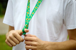
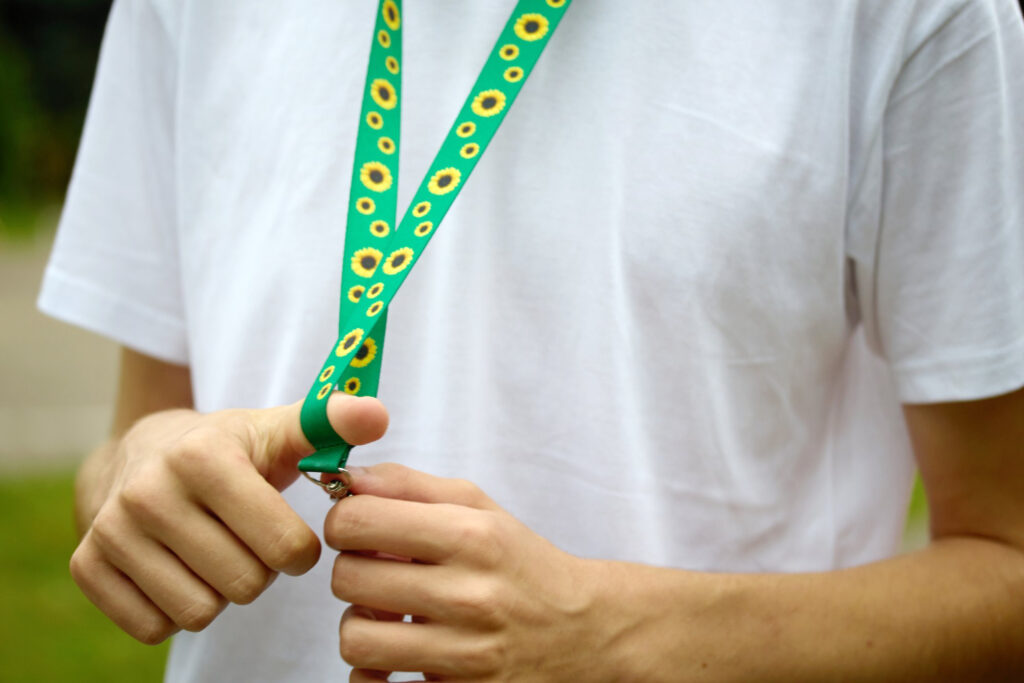
The colour of the cord can reinforce brand recognition. A contrasting attachment can introduce a more energetic character, while a coordinated colour combination may create a cleaner and more premium impression. Even the shape and finish of a clip can affect whether the product appears sporty, technical, casual or corporate.
The mix n match approach makes it possible to treat these components as part of the design rather than simply as functional necessities. Combining different cord and accessory colours allows brands to create a lanyard with more personality while keeping the format simple and practical.
Colour combinations can change the character of the product
Using a single brand colour is an obvious solution, but it is not the only one. Promotional accessories can become more distinctive when primary and secondary brand colours are combined.
A dark cord with a bright attachment creates a completely different impression from a monochrome version. Neutral combinations can work well for professional conferences, while stronger contrasts may be more suitable for festivals, creative events or youth-oriented campaigns.
Colour can also help distinguish groups within the same event. Organisers may choose one variation for staff, another for speakers and a third for participants. The lanyards remain part of the same visual family, but each group becomes easier to identify.
This shows how a relatively small accessory choice can have both visual and organisational value.
The attachment should reflect how the lanyard will be used
A lanyard should not be designed only around its appearance. The object attached to it and the way it will be used are equally important.
For some events, the main purpose is to hold an identification badge. In other situations, the lanyard may carry keys, access cards or another lightweight item. Different applications can call for different connectors and accessories.
Choosing the right solution can make the product feel much more intentional. A practical attachment that suits the situation improves usability, while a poorly chosen component may make an otherwise attractive lanyard inconvenient.
For that reason, the design process should begin with a simple question: what will people actually do with the product?
Small contrasts can make a simple design more memorable
Promotional merchandise does not always need large graphics to attract attention. In some cases, a small contrasting component can become the most recognisable part of the design.
A distinctive clip, connector or coloured detail can break up an otherwise simple lanyard and give it a more individual character. It can also reference another element of the brand identity, such as the colour of a logo, packaging or campaign artwork.
This approach works particularly well when the aim is to create merchandise that feels less conventional. Instead of increasing the amount of branding, the designer uses colour and product construction to make the accessory recognisable.
Consistency is still important
More customisation does not automatically create a better result. If too many colours or components compete for attention, the lanyard may start to feel visually chaotic.
The strongest combinations usually have a clear hierarchy. One colour can dominate, while another works as an accent. Accessories should complement the cord rather than distract from it.
It is also worth considering how the lanyard fits with other event materials. Badges, wristbands, staff clothing, signage and welcome packs may all use elements of the same visual language. When these details are coordinated, even simple products contribute to a more polished brand experience. At company events, small details like these can go hand in hand with thoughtful employee appreciation activities, helping staff feel valued.
TEDGIFTED offers different MIX’N’MATCH lanyard combinations, making it possible to use colour variations and accessories as part of the overall product concept rather than treating every lanyard in exactly the same way.
A small product can communicate attention to detail
People may not consciously remember the exact type of clip or connector used on a lanyard, but they can notice when a product feels well considered. This perception contributes to how they evaluate the wider event or brand.
A carefully selected combination of cord, accessories and colours can make a simple promotional product look more intentional and distinctive. It can also improve usability and help the accessory fit naturally into the environment in which it is being used.
That is why small choices matter. A promotional lanyard does not need to become complicated to stand out. Sometimes changing one colour, one attachment or one finishing detail is enough to transform the entire impression of the product.