
Most people who struggle to find colours that look good on them are buying shades that fight their natural genetics. You walk into a clothing store, see a camel coat or an oatmeal sweater on a mannequin, buy it, try it on at home and wonder why your face looks tired the second you put it on.
Your jawline looks softer, your eyes look dull and your skin takes on an uneven, pale yellow tint.
That happens because warm earth tones clash directly with cool undertones and dark contrast. When your natural hair is dark, your eyes are deep and your skin needs clear, rich pigments to look healthy, you belong in the deep winter color palette.
Often called dark winter in seasonal color analysis, this group represents the darkest, richest part of the twelve-season system. It sits right where the cool chill of winter meets the dark depth of autumn.
Understanding how this seasonal profile works helps you choose shades that make your face stand out, avoid expensive shopping mistakes and use deep pigments like emerald green paint and ink blue paint to add warmth to your home.
The Genetics and Contrast Behind Deep Winter Skin
To understand why certain winter colours work on your skin while others look terrible, you have to look at how your eyes, hair and skin work together under natural light.
Seasonal color systems look at three basic physical traits:
- Temperature: Whether your skin undertone is cool (blue base) or warm (yellow base).
- Value: How light or dark your overall features are on a scale from pure white to jet black.
- Chroma: Whether your features need clean, rich pigment or soft, muted pigment.
What Deep Value Means
Value is the main feature of a deep winter. When you look in the mirror, the first thing anyone sees is darkness. Most deep winters have medium brown, dark brown, dark espresso or black hair. Their eyes are dark and rich, ranging from deep brown and black-brown to dark hazel, dark slate or deep forest green.
Skin tone can range widely across every ethnic background. A deep winter can have pale porcelain skin, cool olive skin, neutral beige skin, deep bronze skin or dark black skin. Your skin itself does not need to be dark. What counts is the sharp contrast between your dark hair, deep eyes and skin.
Cool Undertones vs Pink Cheeks
A common mistake people make is thinking they have warm skin just because they have pink or red cheeks. Rosacea, sun exposure and surface flushing happen on the surface layer of the skin. That redness is not your undertone.
Your real undertone sits under the surface. Deep winters have cool, blue-based undertones. When warm colours like mustard, rust, or peach sit next to cool undertones, the yellow in the cloth highlights yellow, tired tones in your skin. When cool blue-based colours sit next to your face, they calm the surface redness and make your skin look clean and clear.
Natural High Contrast
The third big trait is contrast. Deep winters have strong contrast across their face. The white part of the eyes is clear and bright next to dark irises. The dark hair frames the face with a clean outline.
Because your face naturally has high contrast, wearing low-contrast outfits like beige pants with an oatmeal sweater makes you look washed out. Your clothes need to match the natural contrast of your face.
Comparing Deep Winter With Other Seasonal Palettes
People often waste money buying clothes from the wrong seasonal chart. Comparing deep winter directly against the other winter and summer groups makes the differences easy to see:
Deep Winter vs True Winter
A true winter color palette, also known as a true winter colour palette or classic true winter colours, sits in the cold center of the winter season. True winter has pure cool temperature with zero warmth. Their best colours are bright fuchsia pink, icy silver, stark royal blue and clear emerald.
A deep winter color palette sits right on the edge of autumn. That autumn connection adds extra darkness and weight to the palette. While icy pastel blue can look a little faded on a deep winter, deep winters can easily wear dark teal, deep burgundy, dark espresso and deep pine green that would feel too heavy on a true winter.
Deep Winter vs Bright Winter
A bright winter color palette, also called a clear winter color palette or bright winter colour palette, is built around extreme brightness and clarity. Bright winters usually have bright, glassy eyes that look great in neon-level colours like hot magenta, electric yellow and intense turquoise.
Deep winter is built around darkness rather than neon glow. If a deep winter wears a neon yellow top, the top grabs all the attention while the face gets lost. Deep winters need dark, saturated jewel tones like dark plum, black cherry and midnight navy that ground their features.
Deep Winter vs Cool Summer
A cool summer color palette shares cool blue undertones with winter, but the pigment is soft and faded with grey. Cool summer shades include dusty slate, soft mauve, greyish lavender and light denim blue.
When a deep winter wears cool summer pastels, the weak pigment washes the face out completely. Soft pastels look like faded sleepwear against dark hair and deep eyes. Deep winters need dark, solid colour that holds its ground.
Deep Winter vs Deep Autumn
Because deep winter and deep autumn sit next to each other, they share heavy depth and dark value. Both seasons look great in dark navy and dark espresso brown.
The difference is undertone. Deep autumn has warm, golden undertones that look great in rich rust, burnt orange, mustard yellow, olive green and warm camel. If a deep winter wears those same warm shades, the golden undertone clashes with cool skin, making the face look yellow and tired. Deep winter needs cool burgundy, jet black, pine green and navy instead.
The Complete Deep Winter Colour Swatch Guide
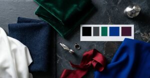
When building a wardrobe, split your colours into practical groups so putting together daily outfits feels simple:
| Colour Family | Great Deep Winter Choices | Shades to Avoid |
|---|---|---|
| Dark Base Neutrals | Jet black, charcoal grey, midnight navy, dark espresso | Warm camel, oatmeal, sand, light beige |
| Light Contrast | Pure stark white, bright chalk white, icy silver | Warm cream, ivory, pale buttercup, ecru |
| Deep Blues | Navy blue, ink blue, dark sapphire, cobalt blue | Sky blue, pastel blue, pale aqua |
| Rich Greens | Deep pine green, forest green, dark emerald green | Olive khaki, moss green, lime green |
| Bold Reds & Pinks | Blue-based true red, cranberry, deep burgundy, plum | Tomato red, warm terracotta, peach, coral |
| Dark Purples | Aubergine, dark blackberry, royal violet, black plum | Lavender, pastel lilac, dusty mauve |
| Accent Brights | Icy lavender, frosted mint, bright cobalt blue | Mustard yellow, burnt orange, golden brown |
Why Jet Black is Your Best Everyday Neutral
Many stylists tell people to stay away from black because it overpowers soft or light skin tones. For a deep winter, jet black is an everyday essential.
Because your hair and eyes already carry dark value, wearing black frames your face without hiding your features. It sharpens your jawline, makes your eyes pop and gives your skin a clean look. A black wool coat, a black knit sweater and black tailored pants form the base of an easy capsule wardrobe. You can read our detailed trouser fit and style guide to see how tailored cuts look with dark base shades.
The Power of Pure White
While black provides depth, pure stark white gives clean contrast. Deep winters look best in clean, bright white cotton shirts and t-shirts.
Off-white, cream, ivory and linen beige look dirty and worn next to deep winter skin. If you are buying button-down shirts, always pick bright optic white over cream or ecru.
Jewel Accents and Blue Shades
Deep winters look best when pairing a dark neutral base with one rich jewel colour. Shades like royal purple, dark ruby, pine green and cobalt blue bring energy to heavy coats and knitwear.
A sweater or scarf in a bright cobalt blue colour gives you an instant lift on cold mornings without clashing with your hair or eyes. You can even bring these rich tones into beauty routines by pairing dark jewel tones with spring nails fashion trends using dark berry and deep emerald manicures.
Fabric Textures and How Dyes Work on Clothes
Finding the right colour is only half the work. The fabric you choose controls how rich and clean that colour looks on your body:
Dense Fabrics That Hold Deep Dye
Thin, washed fabrics reflect light unevenly, making dark colours look chalky, faded and cheap. To get the deep richness your skin needs, choose fabrics that take dye cleanly:
- Heavyweight Wool and Cashmere: Natural wool fibres take dye deep into the yarn, giving charcoal, navy and forest green rich, solid depth.
- Cotton Velvet: The dense pile of velvet absorbs light, making dark jewel tones like emerald green and plum look rich and deep.
- Heavy Silk: Unlike raw silk or chiffon, heavy silk reflects light with a smooth sheen, giving jewel tones clean clarity.
- Genuine Leather and Suede: Structured leather creates clean lines that match the sharp contrast of your face. You can check how structured outerwear holds up in our mens leather jackets guide and our detailed best winter coats guide.
Fabrics to Avoid
Stay away from washed-out linen, thin slub cotton, faded light denim and cheap jersey. When black, navy or emerald green are dyed on thin jersey, they turn grey after two or three washes, losing the sharpness you need. If you wear patterned denim, check our guide on styling leopard print jeans to see how dark background prints work with cool neutral sweaters.
Using Deep Winter Shades for Home Paint and Interior Decor
The deep winter color palette works just as well on interior walls as it does in your closet. Many homes suffer from dull grey light outside for much of the year. Painting walls in pale grey or cold white can make living spaces feel flat and empty.
Interior designers regularly use dark, rich winter colours to make living rooms, dining spaces and bedrooms feel grounded and warm:
1. Painting Living Rooms in Emerald Green Paint
An emerald green paint colour turns an open living room or dining room into a warm, comfortable space. Painting all four walls and baseboards in a flat matte emerald green paint wraps the room in deep colour.
Because green sits between warm and cool, an emerald green paint color carries enough blue undertone to stay crisp under indoor lamps. Pair rich green walls with dark wood floors, a charcoal grey rug and brushed silver hardware.
If you have a small room and do not want to paint every wall dark, use an emerald green paint colour on an accent wall, fireplace breast or behind open bookshelves. Hanging a large mirror on a dark accent wall bounces light across the room, which you can plan using our guide on where to place an arch mirror for maximum natural light.
2. Hallways and Kitchens in Ink Blue Paint
Standard bright navy can feel too bold on large walls, but inky blackened blues add incredible depth. Painting hallway walls, home entryways or kitchen cabinets in a rich ink blue paint looks clean and timeless.
In rooms with north-facing windows where daylight is limited, pale blue paint often looks cold. Because ink blue paint is mixed with black pigment, it absorbs shadows and makes the room feel warm and peaceful. It pairs cleanly with bright white moldings, light countertops and chrome fixtures.
3. Cobalt Blue Accents in Home Decor
While dark green and ink blue work best on large wall spaces, touches of cobalt blue bring modern energy into any room.
Bring the cobalt blue colour into a room through ceramic table lamps, framed artwork, throw pillows or decorative floor rugs. A single piece of cobalt blue pottery on a dark wood table gives the room a bright focal point that lifts the entire space.
Makeup and Hair Guidelines That Match Your Undertones
Wearing the right clothes will not help if your hair dye or makeup fights your natural undertone:
Foundation and Concealer
Always match your foundation to your neck and collarbone, not the temporary redness on your cheeks. Look for neutral-cool or cool foundation shades. Avoid warm yellow or golden foundations, which look like a yellow mask on deep winter skin.
Lipstick Shades
Deep winters can wear dark, bold lip shades that look much too heavy on other skin profiles:
- Everyday Shades: Deep berry, plum-rose and cool soft burgundy.
- Bold Shades: Black cherry, dark blackberry and classic blue-red. A satin or soft matte finish looks clean and polished.
- Shades to Avoid: Warm peach, coral, terracotta, light beige nude and orange-red. Pale nude lipsticks wash out your mouth and make you look sick.
Eye Makeup
Keep eye makeup clean and sharp:
- Eyeliner: Jet black, deep charcoal or dark midnight navy. A clean pencil or liquid line flatters deep winter eyes best.
- Eyeshadow: Slate grey, cool taupe, frosted silver and deep plum. Stay away from warm copper, bronze, gold and orange palettes.
Hair Colour Rules
The most common mistake deep winter women make is adding warm blonde highlights or golden caramel balayage to their hair.
Warm highlights clash with cool skin, make your face look red or sallow and quickly turn an unappealing brassy orange from mineral-heavy tap water.
If you dye your hair, stick to cool dark tones:
- Deep espresso brown with ash undertones
- Dark bitter chocolate brown
- Glossy blue-black
Ask your colourist for an ash gloss every six to eight weeks to remove warm orange tones and use a blue toning shampoo once a week.
Frequently Asked Questions About Deep Winter
Can deep winters wear gold jewellery
Yes, but only if the gold is very pale, cool or white gold. Bright yellow gold and brass clash with the cool undertones of your skin. If you wear gold jewellery, pick pieces set with cool dark stones like dark sapphire, emerald or ruby to balance the metal.
What is the main difference between deep winter and deep autumn
The main difference is undertone. Deep winter has cool blue undertones, while deep autumn has warm golden undertones. Deep winter looks best in jet black, pure white, navy and blue-red.
Is black or navy better for a deep winter
Both look great. Jet black gives the sharpest contrast against your face and works best for evening wear, winter coats and tailoring. Midnight navy is slightly softer, making it a great option for office wear and casual sweaters.
Can deep winters wear pure white
Yes. Pure stark white is one of the most flattering neutrals a deep winter can wear. While soft summer types look best in off-white or cream, deep winters need the clean, high contrast that only bright, crisp white provides.
What hair colour suits deep winter skin best
Your natural dark shade is almost always the most flattering choice. If you dye your hair, pick rich espresso brown, cool ash brown or glossy blue-black. Avoid warm blonde highlights, caramel balayage and copper reds, which clash with cool skin.
Can deep winters wear pastel colours
Most pale pastels make deep winters look sick and washed out. The only light colours that work are icy pastels, like frozen mint, pale ice blue, icy lilac or frosty silver, worn as a high-contrast piece against a dark black or navy coat.
Can a deep winter wear brown clothing
Yes, but only if the brown is very dark and cool. Look for deep espresso, dark chocolate or blackened brown that looks almost black in dim light. Stay away from warm milk chocolate, camel, cognac, caramel and tan.
Why do beige and camel make deep winters look tired
Beige and camel are warm, muted, low-contrast colours. When placed near deep winter skin, their warm yellow pigments pull out surface yellow tones while their low contrast washes out the sharpness of your dark hair and eyes.
What is the easiest way to test if I am a deep winter at home
Wash off all makeup, sit by a window with natural daylight and hold a bright white towel under your chin, followed by a warm cream towel. If bright white brings out your eyes and makes your face look clean while cream makes your skin look yellow or tired, you are a winter.
Summary
The deep winter color palette is built on rich depth, cool undertones and clean visual contrast. When you build your wardrobe around jet black, midnight navy, charcoal grey and intense jewel tones like cobalt blue, deep emerald green and rich burgundy, picking an outfit each morning becomes simple and your clothes look great together.
Using those same dark shades on your walls with emerald green paint and deep ink blue paint turns cold rooms into warm, comfortable spaces throughout the year.
For more style advice, wardrobe planning and home decor guides, explore the latest articles on Monday Magazine.





1 thought on “Deep Winter Color Palette Guide for Clothes and Home Paint”
Comments are closed.